Mummies
design, creative direction
BRIEF
Rebrand a traveling exhibition to drive attendance for a Los Angeles audience.
PROCESS
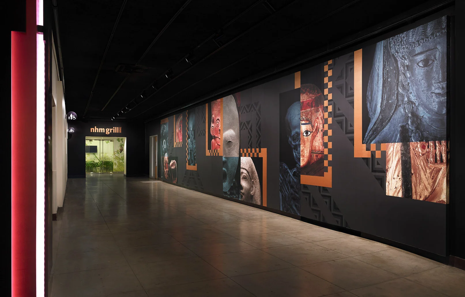
CT scans of mummies (revealing the bone structures inside without unwrapping them) were the highlight of this exhibition, but the lending institution wouldn't let us use the images, citing concerns about exploiting human remains. We pushed back and pitched a compromise; when they saw our respectful “half-wrapped” design solution, they approved. The compelling campaign drove record attendance.
Directing guests to the exhibition entrance was a challenge – it was on the ground level, far from the main entrance. By breadcrumbing the identity through the Museum, we playfully led the way - hieroglyphic floor graphics and indoor billboards point to the stairwell (which sort of looks like the entrance to a tomb!), and wall graphics on the landings draw visitors downstairs.
On the final landing was a larger-than-life lenticular mummy. As guests descended the stairs, the image flipped from mummy to skeleton and back again. I spent hours measuring, testing, and figuring out how to make a lenticular work at that scale…and I wasn’t 100% sure it would have the desired effect until it was installed...but it did, and it was SO COOL to watch people play with it.
The installation of all these graphics took place in a single night (because of timing with one exhibition coming down and another going up). I spent the entire night in the Museum...with the mummies!!


